

英文:
What is the principle behind the automatic height setting in flexbox when wrap
问题
这是代码:
<!-- 开始代码片段:js 隐藏: false 控制台: true Babel: false -->

<!-- 语言: lang-css -->

.container {
  display: flex;
  flex-wrap: wrap;
  width: 400px;
  height: 400px;
  background-color: antiquewhite;
}

.first {
  width: 200px;
  background-color: aquamarine;
}

.second {
  width: 200px;
  background-color: rgb(122, 88, 177);
}

.third {
  width: 200px;
  height: 200px;
  background-color: rgb(79, 152, 91);
}

<!-- 语言: lang-html -->

<div class="container">
  <div class="first"></div>
  <div class="second"></div>
  <div class="third"></div>
</div>

<!-- 结束代码片段 -->
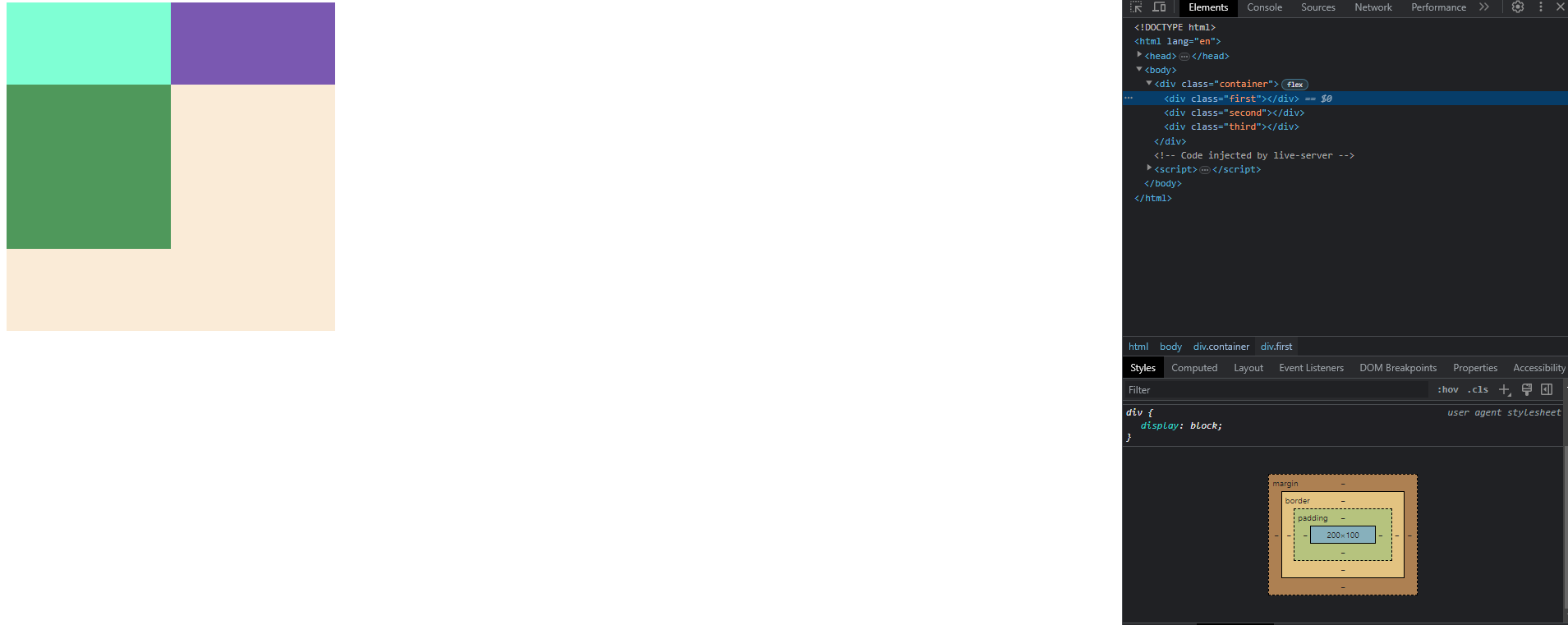
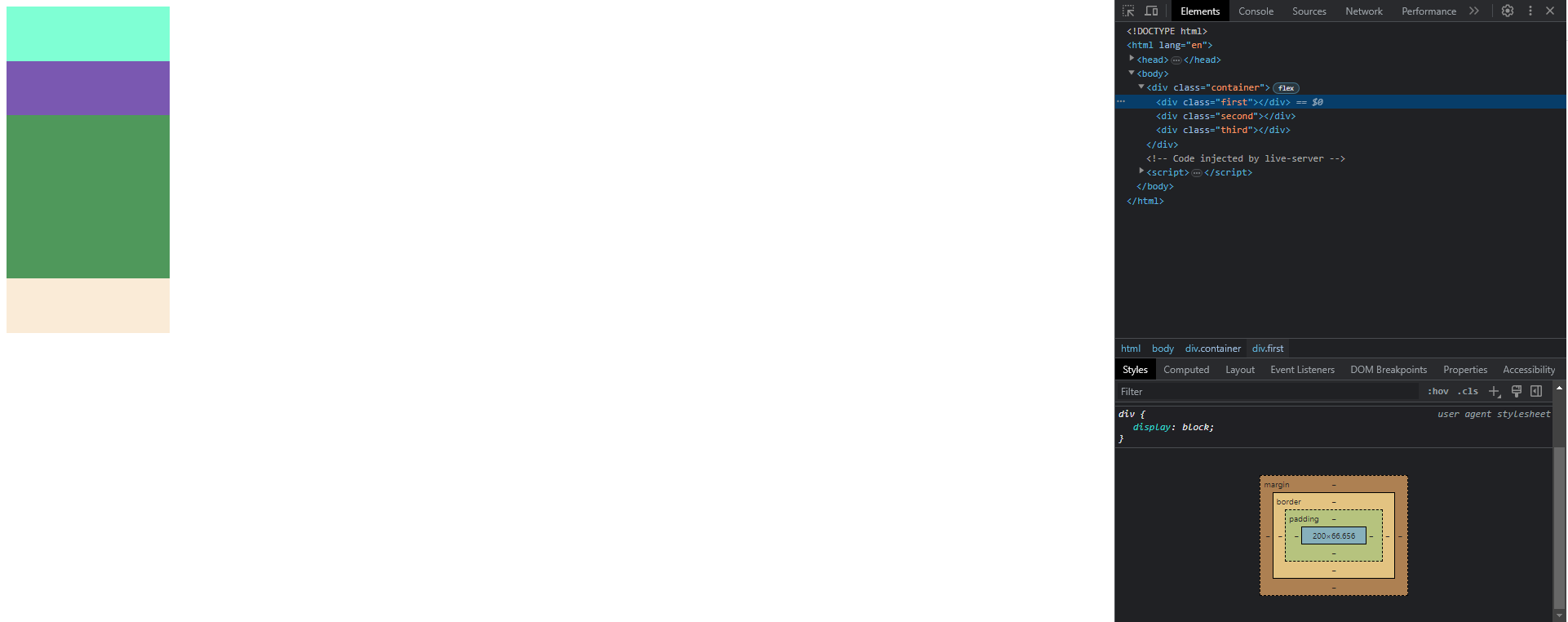
当 .container 的宽度为 400px 时,.third 块会换行到另一行,而 .first 和 .second 元素的高度为 100px。但是当 .container 的宽度为 200px 时,.first 和 .second 元素的高度为 66.6px。
我不明白为什么会发生这种情况以及它是如何工作的。
我尝试以一种逻辑方式来解决这个问题,但尺寸不符合任何计算。
第一种情况的示意图:
第二种情况的示意图:
英文:
This is the code:
<!-- begin snippet: js hide: false console: true babel: false -->
<!-- language: lang-css -->
.container {
  display: flex;
  flex-wrap: wrap;
  width: 400px;
  height: 400px;
  background-color: antiquewhite;
}

.first {
  width: 200px;
  background-color: aquamarine;
}

.second {
  width: 200px;
  background-color: rgb(122, 88, 177);
}

.third {
  width: 200px;
  height: 200px;
  background-color: rgb(79, 152, 91);
}
<!-- language: lang-html -->
<div class="container">
  <div class="first"></div>
  <div class="second"></div>
  <div class="third"></div>
</div>
<!-- end snippet -->
When .container has 400px width .third block wrap onto another line and .first and .second elements have height 100px, but when .container has 200px width .first and .second element have 66.6px height.
I don't understand why this happening and how it works.
I tried to to figure it out in some logical way but dimensions don't fit any calculations.
答案1
得分: 2
TL;DR 弹性盒子布局算法规范1提供了你所寻找的答案,但它有点复杂。
首先,我们需要回答一个问题,为什么第一个和第二个 div 会有任何高度 - 因为它们既没有内容,也没有定义的 height 值。在正常情况下,它们应该是不可见的!但是我们可以看到它们。这是因为弹性容器会尝试跨越交叉轴(默认情况下)拉伸项目。
在考虑的弹性容器中,主轴是X(与宽度相关),交叉轴是Y(与高度相关)。换句话说,height 是“交叉”维度。因此,确定项目的高度在规范中被描述为“交叉尺寸确定”。以下是一节的摘录:
> 9.4. 交叉尺寸确定
>
> 7. 通过使用已使用的主尺寸和可用空间执行布局,将每个项目的假设交叉尺寸确定为 auto 。
>
> 8. 计算每个弹性行的交叉尺寸。
>
> 如果弹性容器是单行并具有确定的交叉尺寸,
> 弹性行的交叉尺寸是弹性容器的内部交叉尺寸。
>
> 否则,对于每一行:
> 1. 收集所有内联轴与主轴平行、align-self 为 baseline 且交叉轴边距均为非 auto 的弹性项目。
> 找到每个项目的基线与其假设的外部交叉起始边之间的距离之间的最大值,
> 以及每个项目的基线与其假设的外部交叉结束边之间的距离之间的最大值,并将这两个值相加。
> 2. 在之前步骤未收集的所有项目中,找到最大的外部假设交叉尺寸。
>
> 3. 弹性行的使用交叉尺寸是在前两个步骤中找到的数字中最大的值和零。
摘自:https://www.w3.org/TR/css-flexbox-1/#cross-sizing
你可以按照这些步骤来找出你所询问的原理。你看到的 66.6px 可能是来自步骤 7 中的“假设交叉尺寸”的计算。
1 https://www.w3.org/TR/css-flexbox-1/#layout-algorithm
英文:
TL;DR The Flexbox Algorithm specification 1 has the answers you are looking for, but it's kinda complicated.
To begin, we need to answer a question why first and second div even have any height at all - as they don't have any content nor defined height value. In normal conditions they should be invisible! But we can see them. This is because flex container will try to stretch the items across the cross axis (by default).
In considered flex container, main axis is X (related to width) and cross axis is Y (related to height). In other words, height is "cross" dimension. Determining height of your items is therefore described in the spec as "Cross Size Determination". Here is an excerpt:
> 9.4. Cross Size Determination
>
> 7. Determine the hypothetical cross size of each item by performing layout with the used main size and the available space, treating auto
> as fit-content.
>
> 8. Calculate the cross size of each flex line.
>
> If the flex container is single-line and has a definite cross size,
> the cross size of the flex line is the flex container’s inner cross
> size.
>
> Otherwise, for each flex line:
> 1. Collect all the flex items whose inline-axis is parallel to the main-axis, whose align-self is baseline, and whose cross-axis
> margins are both non-auto. Find the largest of the distances between
> each item’s baseline and its hypothetical outer cross-start edge, and
> the largest of the distances between each item’s baseline and its
> hypothetical outer cross-end edge, and sum these two values.
> 2. Among all the items not collected by the previous step, find the largest outer hypothetical cross size.
>
> 3. The used cross-size of the flex line is the largest of the numbers found in the previous two steps and zero.
Taken from: https://www.w3.org/TR/css-flexbox-1/#cross-sizing
You can follow these steps to figure out the principle you are asking for. The 66.6px you are seeing probably comes from the calculation of "hypothetical cross size" in step 7 above.
通过集体智慧和协作来改善编程学习和解决问题的方式。致力于成为全球开发者共同参与的知识库,让每个人都能够通过互相帮助和分享经验来进步。
评论