

英文:
How to achieve similar visual to frosted glass for layers below of an image stacked effect
问题
我想要实现与示例图片相同的效果,在主要图片后面有两层相同色调的图层:
这是我到目前为止尝试过的:
我的尝试:我将主要图片复制了3次,并将它们叠加在一起。然而,我仍然不知道如何样式化第二和第三个图层以达到与示例图片相同的效果。我尝试了模糊和磨砂玻璃效果,但看起来很难看。
CSS
/* 第二层 */
.song-image-container
{
  position:absolute;
  top: 12px;
  left: 12px;
  z-index: 1;
}

/* 第一层 */
.song-image-container2 {
  position: relative;
  top: 0;
  left: 0;
  z-index: 2;
}

/* 第三层 */
.song-image-container3
{
  position: absolute;
  top: 22px;
  left: 22px;
  z-index: 0;
}
如果有关如何实现特定效果的建议,将不胜感激。
英文:
I want to achieve this same effect as this sample picture where there is 2 layers of the same color tone behind the main image: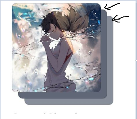
Here is what I have tried so far:
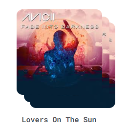
My attempt: I duplicated the main image 3 times and stacked them on top of each other. However, I still have no idea how to style 2nd and 3rd image layer to achieve the same effect as the sample picture. I have tried blurred and frosted glass effects but it just look hideous.
<div v-for="song in top4Songs" :key="song.id" class="song-container">
        <div id="parent">
          <div>
              <div class="song-image-container">
                  <img :src="song.coverUrl">
              </div>

            <div class="song-info">
                <div class="song-image-container2">
                <img :src="song.coverUrl">
                <h2>{{song.title}}</h2>
            </div>

            </div>
            <div class="song-image-container3">
              <img :src="song.coverUrl">

            </div>
          </div>
        </div>
CSS
/* second layer */
.song-image-container
{
  position:absolute;
  top: 12px;
  left: 12px;
  z-index: 1;
}

/* first layer */
.song-image-container2 {
  position: relative;
  top: 0;
  left: 0;
  z-index: 2;
  /*  */
}
/*third layer*/
.song-image-container3
{
  position: absolute;
  top: 22px;
  left: 22px;
  z-index: 0;
}
Any suggestions to achieve this specific effect would be really appreciated.
答案1
得分: 2
创建一个覆盖在每个图像顶部的叠加层,示例代码如下:
<div class="song-image-container">
    <img width="300" :src="song.coverURL">
    <div class="song-image-overlay"></div>
</div>
给叠加层设置低透明度的灰色和背景模糊效果,示例CSS代码如下:
.song-image-overlay
{
    width: 100%;
    height: 100%;
    position: absolute;
    top: 12px;
    left: 12px;
    z-index: 1;
    background-color: rgba(0, 0, 0, 0.3);
    backdrop-filter: blur(20px);
}
根据您的喜好调整颜色、透明度和模糊度,以使两个图像在原始图像后面。
如果这个解决方案不符合您的需求,请查看此链接:https://stackoverflow.com/questions/2541481/get-average-color-of-image-via-javascript
英文:
create an overlay that covers the top of each image Ex:
<div class="song-image-container">
     <img width="300" :src="song.coverURL">
     <div class="song-image-overlay"></div>
 </div>
Give the overlay a low opacity gray and a back-drop blur Ex:
.song-image-overlay
{
    width: 100%;
    height: 100%;
    position: absolute;
    top: 12px;
    left: 12px;
    z-index: 1;
    background-color: rgba(0, 0, 0, 0.3);
    backdrop-filter: blur(20px);
}
adjust the color, opacity, and blur to your liking between the two images behind your original image.
If this solution doesn't fit your needs, check this link: https://stackoverflow.com/questions/2541481/get-average-color-of-image-via-javascript
答案2
得分: 1
你可以使用一个div和图片来实现这个效果。只需在div上添加::before和::after伪元素,并适当地设置它们的样式。透明度的样式可能不适用于::before和::after,但你应该能够根据这个示例来完成。
.song-image-container {
  border-radius: 20px;
  height: 360px;
  position: relative;
  width: 360px;
}

.song-image-container img {
  border-radius: 20px;
  height: 100%;
  object-fit: cover;
  width: 100%;
}

.song-image-container::before,
.song-image-container::after {
  background-image: url(https://images.unsplash.com/photo-1495615080073-6b89c9839ce0?ixlib=rb-4.0.3&ixid=M3wxMjA3fDB8MHxzZWFyY2h8Mnx8c3F1YXJlfGVufDB8fDB8fHww&auto=format&fit=crop&w=800&q=60);
  background-size: cover;
  border-radius: 20px;
  content: '';
  height: 100%;
  left: 12px;
  opacity: 0.5;
  position: absolute;
  top: 12px;
  z-index: -1;
  width: 100%;
}
.song-image-container::after {
  border-radius: 20px;
  content: '';
  left: 24px;
  top: 24px;
  z-index: -2;
}

body {
  display: grid;
  height: 100vh;
  margin: 0;
  place-items: center;
}
如果需要通过标记提供背景图片,只需在标记中添加style="background-image: url(...imageurl...);"。这将给你相同的效果,而且你不需要为每个元素调整CSS。
英文:
You can achieve this with one div and the image. You just need to add a ::before and ::after to the div and style them appropriately. The opacity styling might not be right here for the ::before and ::after, but you should be able to land the plane from here.
<!-- begin snippet: js hide: false console: true babel: false -->
<!-- language: lang-css -->
.song-image-container {
  border-radius: 20px;
  height: 360px;
  position: relative;
  width: 360px;
}

.song-image-container img {
  border-radius: 20px;
  height: 100%;
  object-fit: cover;
  width: 100%;
}

.song-image-container::before,
.song-image-container::after {
  background-image: url(https://images.unsplash.com/photo-1495615080073-6b89c9839ce0?ixlib=rb-4.0.3&ixid=M3wxMjA3fDB8MHxzZWFyY2h8Mnx8c3F1YXJlfGVufDB8fDB8fHww&auto=format&fit=crop&w=800&q=60);
  background-size: cover;
  border-radius: 20px;
  content: '';
  height: 100%;
  left: 12px;
  opacity: 0.5;
  position: absolute;
  top: 12px;
  z-index: -1;
  width: 100%;
}
.song-image-container::after {
  border-radius: 20px;
  content: '';
  left: 24px;
  top: 24px;
  z-index: -2;
}

body {
	display: grid;
	height: 100vh;
	margin: 0;
	place-items: center;
}
<!-- language: lang-html -->
<div class="song-image-container">
  <img src="https://images.unsplash.com/photo-1495615080073-6b89c9839ce0?ixlib=rb-4.0.3&ixid=M3wxMjA3fDB8MHxzZWFyY2h8Mnx8c3F1YXJlfGVufDB8fDB8fHww&auto=format&fit=crop&w=800&q=60" alt="cover art for...">
</div>
<!-- end snippet -->
If you needed to supply the image for the background via the markup, you could just add style="background-image: url(...imageurl...);". This would give you the same effect and you wouldn't need to adjust the CSS for each element.
通过集体智慧和协作来改善编程学习和解决问题的方式。致力于成为全球开发者共同参与的知识库,让每个人都能够通过互相帮助和分享经验来进步。
评论