

英文:
How to set height, width and border-radius in TimePicker component - MUI React
问题
我试图改变TimePicker中输入的高度、宽度和边框半径等属性,但没有成功。有谁知道如何使用sx或slotProps来进行更改吗?这是我的当前代码。
<TimePicker
  ampm={false}
  views={['hours', 'minutes', 'seconds']}
  sx={{
    backgroundColor: "#333335",
    font: "white",
    color: "#FFFF",
    textDecoration: "bold",
    input: {
      color: "#FFFF",
      fontSize: "1.4rem",
    },
    "& .MuiTimePicker-root": {
      backgroundColor: "#222223",
    },
    "& .MuiTimePicker-input": {
      color: "#FFFF",
      fontSize: "1.2rem",
    },
  }}
  slotProps={{
    popper: {
      sx: {
        "& .MuiList-root": {
          backgroundColor: "#333335",
        },
        "& .MuiMenuItem-root": {
          "&.Mui-selected": {
            backgroundColor: "#04395E",
            color: "white"
          },
          color: "white"
        },
        "& .MuiDialogActions-root": {
          backgroundColor: "#333335",
        },
        "& .MuiSvgIcon-root": {
          "&.MuiSvgIcon-fontSizeMedium": {
            backgroundColor: "#04395E",
            color: "white"
          },
          color: "white"
        },
      },
    },
  }}
  value={selectedTime}
  onChange={(newTime) => setSelectedTime(newTime)}
  timeSteps={{ hours: 1, minutes: 1, seconds: 1 }}
/>
英文:
I'm trying to change some properties like height, width and border-radius of the input in TimePicker, but with no success. Does anyone knows how to do change it using sx or slotProps? Here is my current code.
<TimePicker
          ampm={false}
          views={['hours', 'minutes', 'seconds']}
          sx={{
            backgroundColor: "#333335",
            font: "white",
            color: "#FFFF",
            textDecoration: "bold",
            input: {
              color: "#FFFF",
              fontSize: "1.4rem",
            },
              "& .MuiTimePicker-root": {
              backgroundColor: "#222223",
            },
            "& .MuiTimePicker-input": {
              color: "#FFFF",
              fontSize: "1.2rem",
            },
          }}
          slotProps={{
            popper: {
              sx: {
                "& .MuiList-root": {
                  backgroundColor: "#333335",
                },
                "& .MuiMenuItem-root": {
                  "&.Mui-selected": {
                    backgroundColor: "#04395E",
                    color: "white"
                  },
                  color: "white"
                },
                "& .MuiDialogActions-root": {
                  backgroundColor: "#333335",
                },
                "& .MuiSvgIcon-root": {
                  "&.MuiSvgIcon-fontSizeMedium": {
                    backgroundColor: "#04395E",
                    color: "white"
                  },
                  color: "white"
                },
              },
            },
          }}
          value={selectedTime}
          onChange={(newTime: any) => setSelectedTime(newTime)}
          timeSteps={{hours: 1, minutes: 1, seconds: 1}}
/>
答案1
得分: 1
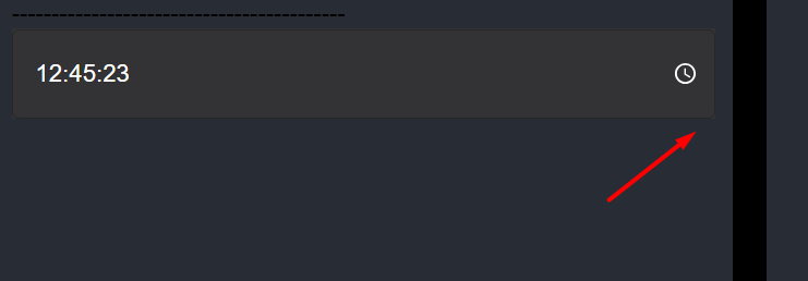
你需要自定义slotProps内的textfield以编辑高度、宽度和边框半径。您可以检查下面的代码 👇
import OutlinedInputClasses from '@mui/material/OutlinedInput/outlinedInputClasses';
<TimePicker
label="Basic time picker"
slotProps={{
textField: {
sx: {
borderRadius: 6,
fieldset: { borderRadius: 6 },
/* 如果您的 TextField 变体更改为 "filled",请使用 FilledInputClasses,否则使用以下内容 */
[`.${OutlinedInputClasses.root}`]: {
height: 80,
width: 300,
},
/* 如果您更改了默认高度,您需要调整输入标签的位置 */
'& .MuiInputLabel-root': { lineHeight: 3 },
},
},
}}
/>
⭐ 注意:确保保持 `borderRadius` 和 `fieldset: {borderRadius: _}` 具有相同的值。
希望能帮助到您。
<details>
<summary>英文:</summary>
You need to customize `textfield` inside `slotProps` to edit height, width and borderRadius. You can check the code below 👇
import OutlinedInputClasses from '@mui/material/OutlinedInput/outlinedInputClasses'
<TimePicker
label="Basic time picker"
slotProps={{
textField: {
sx: {
borderRadius: 6,
fieldset: { borderRadius: 6 },
/* Use FilledInputClasses if your TextField variant changed to "filled" otherwise use below */
[`.${OutlinedInputClasses.root}`]: {
height: 80,
width: 300,
},
/* If you change the default height, you need to adjust the Input Label position as well */
'& .MuiInputLabel-root': { lineHeight: 3 },
},
},
}}
/>
⭐ Note: Make sure keep the `borderRadius` and `fieldset: {borderRadius: _}` to have the same values.
I hope it helps.
</details>
通过集体智慧和协作来改善编程学习和解决问题的方式。致力于成为全球开发者共同参与的知识库,让每个人都能够通过互相帮助和分享经验来进步。
评论