

英文:
CSS Grid layout for 1 large image and 3 small
问题
我试图重新排列这段代码,以获得像屏幕截图一样的网格视图。
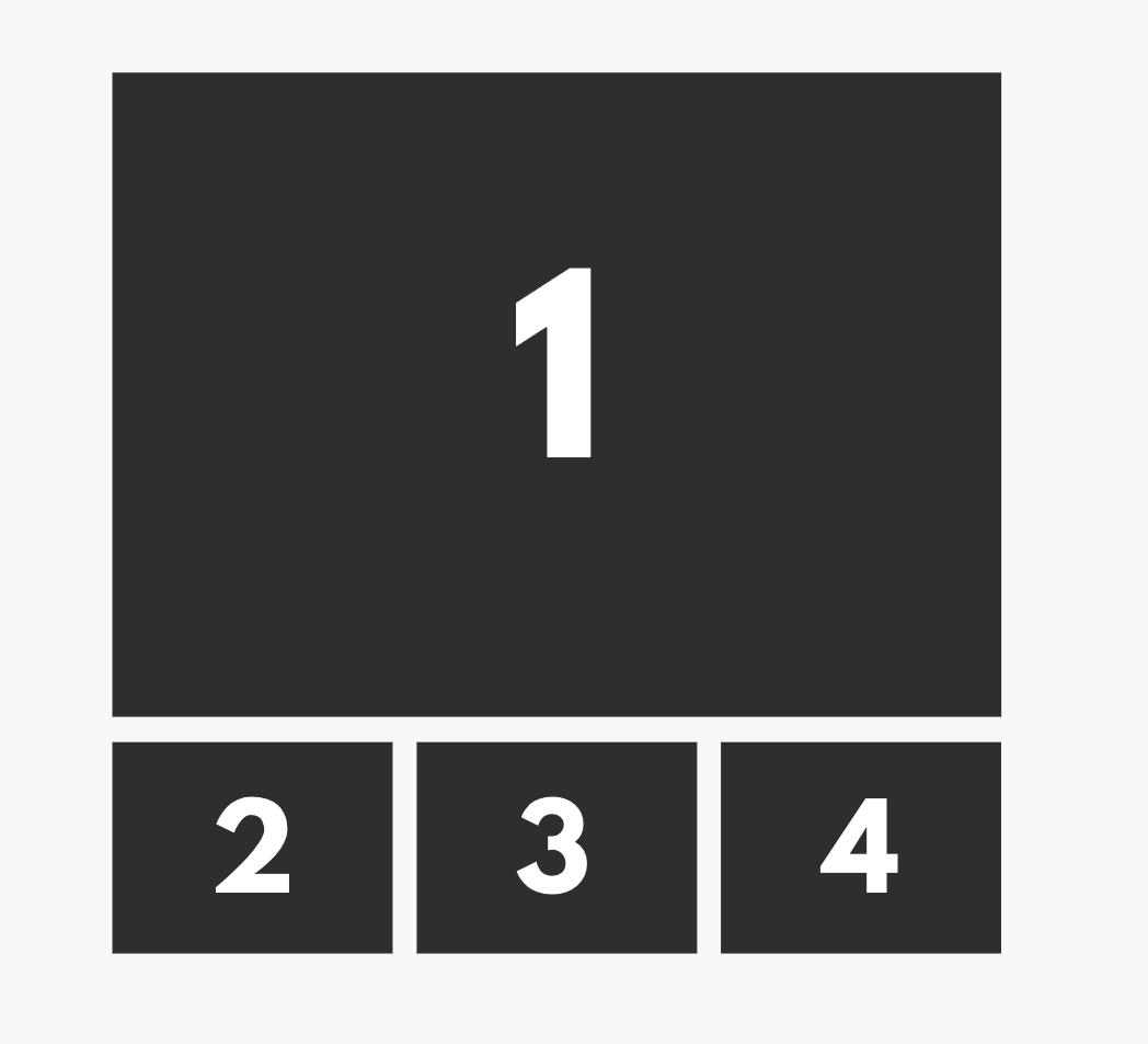
我需要第一张图片占据整个宽度的100%,然后第二行需要3张等宽的图片排列在下方。
DEMO:
http://jsfiddle.net/gycmp21k/
body {
  padding: 40px;
}

* {
  margin: 0px;
  padding: 0px;
}

ul {
  list-style: none;
  display: grid;
  grid-template-columns: 2fr 1fr 1fr;
  grid-template-rows: 1fr 1fr;
  gap: 1rem;
}

li:first-child {
  grid-row: span 2;
}

img {
  display: block;
  width: 100%;
  height: 100%;
  object-fit: cover;
}
<ul>
  <li>
    <img src="https://via.placeholder.com/400" />
  </li>
  <li>
    <img src="https://via.placeholder.com/400" />
  </li>
  <li>
    <img src="https://via.placeholder.com/400" />
  </li>
  <li>
    <img src="https://via.placeholder.com/400" />
  </li>
</ul>
英文:
I'm trying to rearrange this code to get this grid view like the screenshot.
I need the first image in the row to be full width 100%, then the second row I need 3 images of equal width in a row underneath.
DEMO:
http://jsfiddle.net/gycmp21k/
<!-- begin snippet: js hide: false console: true babel: false -->
<!-- language: lang-css -->
body {
  padding: 40px;
}

* {
  margin: 0px;
  padding: 0px;
}

ul {
  list-style: none;
  display: grid;
  grid-template-columns: 2fr 1fr 1fr;
  grid-template-rows: 1fr 1fr;
  gap: 1rem;
}

li:first-child {
  grid-row: span 2;
}

img {
  display: block;
  width: 100%;
  height: 100%;
  object-fit: cover;
}
<!-- language: lang-html -->
<ul>
  <li>
    <img src="https://via.placeholder.com/400" />
  </li>
  <li>
    <img src="https://via.placeholder.com/400" />
  </li>
  <li>
    <img src="https://via.placeholder.com/400" />
  </li>
  <li>
    <img src="https://via.placeholder.com/400" />
  </li>
</ul>
<!-- end snippet -->
答案1
得分: 2
图片2、3和4在您的图片中具有相同的宽度,因此使它们具有相同的宽度。
grid-template-columns: 1fr 1fr 1fr;
图像1和图像2、3和4在您的图片中高度不相同,因此不要使它们具有相同的高度。
grid-template-rows: auto auto;
在您的图片中,图像1跨越多个列而不是多个行,并且它跨越了3列而不是2列。
grid-column: span 3;
英文:
Images 2, 3 and 4 are the same width in your picture, so make them the same width.
grid-template-columns: 1fr 1fr 1fr;
Image 1 and images 2, 3 and 4 are not the same hight in your picture, so don't make them the same height:
grid-template-rows: auto auto;
Image 1 spans across multiple columns not multiple rows in your picture, and it spans across 3 of them, not 2 of them
grid-column: span 3;
<!-- begin snippet: js hide: false console: true babel: false -->
<!-- language: lang-css -->
body {
  padding: 40px;
}

* {
  margin: 0px;
  padding: 0px;
}

ul {
  list-style: none;
  display: grid;
  grid-template-columns: 1fr 1fr 1fr;
  grid-template-rows: auto auto;
  gap: 1rem;
}

li:first-child {
  grid-column: span 3;
}

img {
  display: block;
  width: 100%;
  height: 100%;
  object-fit: cover;
}
<!-- language: lang-html -->
<ul>
  <li>
    <img src="https://via.placeholder.com/400" />
  </li>
  <li>
    <img src="https://via.placeholder.com/400" />
  </li>
  <li>
    <img src="https://via.placeholder.com/400" />
  </li>
  <li>
    <img src="https://via.placeholder.com/400" />
  </li>
</ul>
<!-- end snippet -->
通过集体智慧和协作来改善编程学习和解决问题的方式。致力于成为全球开发者共同参与的知识库,让每个人都能够通过互相帮助和分享经验来进步。
评论