

英文:
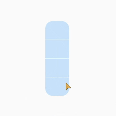
How to do a customise discrete slider like below one in flutter?
问题
我尝试使用滑块和滑块主题的Flutter库来实现。
- 即使我查看了滑块的属性和函数,但我还是不明白如何实现这一点,有人可以帮忙或分享一些想法或指导吗?

英文:
I have tried to achieve using slider and slider theme flutter lib.
-
even i went through property and functions of slider but i am not able get idea how to achieve this one, can anyone help or any idea please to share or guide me.
答案1
得分: 2
Flutter有一个名为Slider的小部件,它几乎可以自定义所有属性,除了分隔属性,对于这一点,我们可以在Slider上面添加一个Container来实现分隔外观。
完整代码如下:
import 'package:flutter/material.dart';

void main() {
  runApp(const MyApp());
}

class MyApp extends StatelessWidget {
  const MyApp({super.key});

  @override
  Widget build(BuildContext context) {
    return MaterialApp(
      title: 'Flutter Demo',
      theme: ThemeData(
        primarySwatch: Colors.blue,
      ),
      home: const Box(),
    );
  }
}

class Box extends StatefulWidget {
  const Box({super.key});

  @override
  State<Box> createState() => _BoxState();
}

void g() {}

class _BoxState extends State<Box> {
  double sliderValue = 50;
  @override
  Widget build(BuildContext context) {
    return SliderTheme(
      data: SliderThemeData(
          trackHeight: 80,
          thumbShape: SliderComponentShape.noOverlay,
          overlayShape: SliderComponentShape.noOverlay,
          valueIndicatorShape: SliderComponentShape.noOverlay,
          activeTrackColor: const Color.fromARGB(255, 9, 84, 146),
          trackShape: const RectangularSliderTrackShape()),
      child: Scaffold(
          body: Center(
              child: Stack(
        alignment: Alignment.center,
        children: [
          SizedBox(
            height: 250,
            width: 80,
            child: RotatedBox(
              quarterTurns: 3,
              child: ClipRRect(
                borderRadius: const BorderRadius.all(Radius.circular(25)),
                child: Slider(
                  onChanged: (value) {
                    setState(() {
                      sliderValue = value;
                    });
                  },
                  value: sliderValue,
                  min: 0,
                  max: 100,
                  divisions: 4,
                ),
              ),
            ),
          ),
          SizedBox(
            height: 250,
            width: 80,
            child: Column(
              mainAxisAlignment: MainAxisAlignment.spaceEvenly,
              children: [
                Container(
                  height: 1,
                  width: 80,
                  color: Colors.white,
                ),
                Container(
                  height: 1,
                  width: 80,
                  color: Colors.white,
                ),
                Container(
                  height: 1,
                  width: 80,
                  color: Colors white,
                ),
              ],
            ),
          ),
        ],
      ))),
    );
  }
}
英文:
Flutter has Slider Widget which has almost all the properties that can be customized except for the divider property, for that we can add Container on top of Slider to give that separation appearance.
Complete Code : -
import 'package:flutter/material.dart';

void main() {
  runApp(const MyApp());
}

class MyApp extends StatelessWidget {
  const MyApp({super.key});

  @override
  Widget build(BuildContext context) {
    return MaterialApp(
      title: 'Flutter Demo',
      theme: ThemeData(
        primarySwatch: Colors.blue,
      ),
      home: const Box(),
    );
  }
}

class Box extends StatefulWidget {
  const Box({super.key});

  @override
  State<Box> createState() => _BoxState();
}

void g() {}

class _BoxState extends State<Box> {
  double sliderValue = 50;
  @override
  Widget build(BuildContext context) {
    return SliderTheme(
      data: SliderThemeData(
          trackHeight: 80,
          thumbShape: SliderComponentShape.noOverlay,
          overlayShape: SliderComponentShape.noOverlay,
          valueIndicatorShape: SliderComponentShape.noOverlay,
          activeTrackColor: const Color.fromARGB(255, 9, 84, 146),
          trackShape: const RectangularSliderTrackShape()),
      child: Scaffold(
          body: Center(
              child: Stack(
        alignment: Alignment.center,
        children: [
          SizedBox(
            height: 250,
            width: 80,
            child: RotatedBox(
              quarterTurns: 3,
              child: ClipRRect(
                borderRadius: const BorderRadius.all(Radius.circular(25)),
                child: Slider(
                  onChanged: (value) {
                    setState(() {
                      sliderValue = value;
                    });
                  },
                  value: sliderValue,
                  min: 0,
                  max: 100,
                  divisions: 4,
                ),
              ),
            ),
          ),
          SizedBox(
            height: 250,
            width: 80,
            child: Column(
              mainAxisAlignment: MainAxisAlignment.spaceEvenly,
              children: [
                Container(
                  height: 1,
                  width: 80,
                  color: Colors.white,
                ),
                Container(
                  height: 1,
                  width: 80,
                  color: Colors.white,
                ),
                Container(
                  height: 1,
                  width: 80,
                  color: Colors.white,
                ),
              ],
            ),
          ),
        ],
      ))),
    );
  }
}
<img src="https://media.giphy.com/media/v1.Y2lkPTc5MGI3NjExZXE2am1mbXVyYzhmbXE4c3djZDk0aDhvejF6NmhsN202aTU3ZXk3YyZlcD12MV9pbnRlcm5hbF9naWZfYnlfaWQmY3Q9Zw/fm0hiwroOP35eyi113/giphy.gif">
通过集体智慧和协作来改善编程学习和解决问题的方式。致力于成为全球开发者共同参与的知识库,让每个人都能够通过互相帮助和分享经验来进步。
评论