

英文:
How to vertically translate an element so its new position is between two other elements?
问题
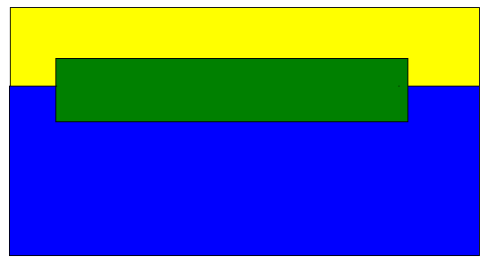
给定一个标题元素和一个主内容元素,我想在它们之间(垂直方向)添加一个条形块,如下所示:
<div id="header">header</div>
<div id="bar">bar</div>
<div id="main-content">main content</div>
应该变成这样(为简化起见,我去掉了绿色块的一些水平空间):
我尝试了以下方法:
#header {
  background: yellow;
  height: 50px;
}

#bar-container {
  position: relative;
  background: green;
  height: 50px;
  margin: 0 50px;
}

#bar {
  position: absolute;
  top: 50%;
  transform: translateY(-50%);
}

#main-content {
  background: blue;
  height: 50px;
}
但这是错误的。我该如何让主内容向上移动,使条形块位于标题和主内容之间?
英文:
Given a header element and a main content element, I want to add a bar between these two ( vertically ) so this
<!-- begin snippet: js hide: true console: true babel: false -->
<!-- language: lang-css -->
#header {
  background: yellow;
  height: 50px;
}

#bar {
  background: green;
  height: 50px;
}

#main-content {
  background: blue;
  height: 50px;
}
<!-- language: lang-html -->
<div id="header">header</div>
<div id="bar">bar</div>
<div id="main-content">main content</div>
<!-- end snippet -->
should become this ( I removed some horizontal space from the green block for the sake of simplicity )
I tried the following
<!-- begin snippet: js hide: false console: true babel: false -->
<!-- language: lang-css -->
#header {
  background: yellow;
  height: 50px;
}

#bar-container {
  position: relative;
  background: green;
  height: 50px;
  margin: 0 50px;
}

#bar {
  position: absolute;
  top: 50%;
  transform: translateY(-50%);
}

#main-content {
  background: blue;
  height: 50px;
}
<!-- language: lang-html -->
<div id="header">header</div>
<div id="bar-container">
  <div id="bar">bar</div>
</div>
<div id="main-content">main-content</div>
<!-- end snippet -->
which is wrong. How can I tell the main content to move up so the bar is between the header and the main content?
答案1
得分: 2
将条形容器的高度设置为0,并将其内容居中。
#bar-container {
  height: 0; /* 0 高度 */
  /* 垂直居中 */
  display: flex;
  align-items: center;
  /**/
}
请注意,上述内容是CSS代码,用于描述如何将条形容器的高度设置为0并将其内容居中。不包括HTML或JavaScript部分。
英文:
Give the bar container a height equal to 0 and center its content
<!-- begin snippet: js hide: false console: true babel: false -->
<!-- language: lang-css -->
#header {
  background: yellow;
  height: 50px;
  padding: 30px 0;
}

#bar-container {
  height: 0; /* 0 height */
  /* center vertically */
  display: flex;
  align-items: center;
  /**/
}

#bar {
  height: 50px;
  width: 80%;
  margin-inline: auto; /* center horizontally */
  background: green;
}

#main-content {
  background: blue;
  height: 50px;
  padding: 30px 0;
}
<!-- language: lang-html -->
<div id="header">header</div>
<div id="bar-container">
  <div id="bar">bar</div>
</div>
<div id="main-content">main-content</div>
<!-- end snippet -->
答案2
得分: 1
option1:
<div id="header">header</div>
<div id="bar">bar</div>
<div id="main-content">main content</div>
option 2:
<div id="header">header</div>
<div id="bar">bar</div>
<div id="main-content">main content</div>
英文:
Two other approaches with grid:
option1:
<!-- begin snippet: js hide: false console: true babel: false -->
<!-- language: lang-css -->
div {
  min-height: 50px; /*all divs at least 50px*/
}

#header {
  background: yellow;
  grid-area: 1 / 1; /*overlap header and bar*/
}

#bar {
  background: green;
  grid-area: 1 / 1; /*overlap header and bar*/
  margin: 0 4rem; /*margin to bring in sides of bar*/
  transform: translateY(50%); /*translate on the Y axis*/
}

#main-content {
  background: blue;
}

body {
  display: grid; /*use grid on parent*/
  grid-template-rows: min-content 1fr; /*2 grid rows*/

  margin: 0;
  height: 100%;
}

html {
  height: 100%;
}
<!-- language: lang-html -->
<div id="header">header</div>
<div id="bar">bar</div>
<div id="main-content">main content</div>
<!-- end snippet -->
option 2:
<!-- begin snippet: js hide: false console: true babel: false -->
<!-- language: lang-css -->
div {
  min-height: 50px; /*all divs at least 50px*/
}

#header {
  background: yellow;
}

#bar {
  background: green;
  position: absolute; /*remove bar from document flow*/
  inset: 25px 25px auto; /*position bar 25px from top/right/left*/
}

#main-content {
  background: blue;
}

body {
  display: grid; /*use grid on parent*/
  grid-template-rows: min-content 1fr; /*2 grid rows*/
  position: relative; /*use relative on parent*/

  margin: 0;
  height: 100%;
}

html {
  height: 100%;
}
<!-- language: lang-html -->
<div id="header">header</div>
<div id="bar">bar</div>
<div id="main-content">main content</div>
<!-- end snippet -->
通过集体智慧和协作来改善编程学习和解决问题的方式。致力于成为全球开发者共同参与的知识库,让每个人都能够通过互相帮助和分享经验来进步。
评论